This was one of the first projects that our newly formed company, BatteryCake, took on outside of our flagship project.
CHAOS was a newly formed e-sports brand that was in need of a fresh new logo design. Our initial meeting with the client was fun and inspiring. They were already familiar with some of our work and seemed excited to see what we came up with. However, our presentation of initial concept art was met with disappointment.
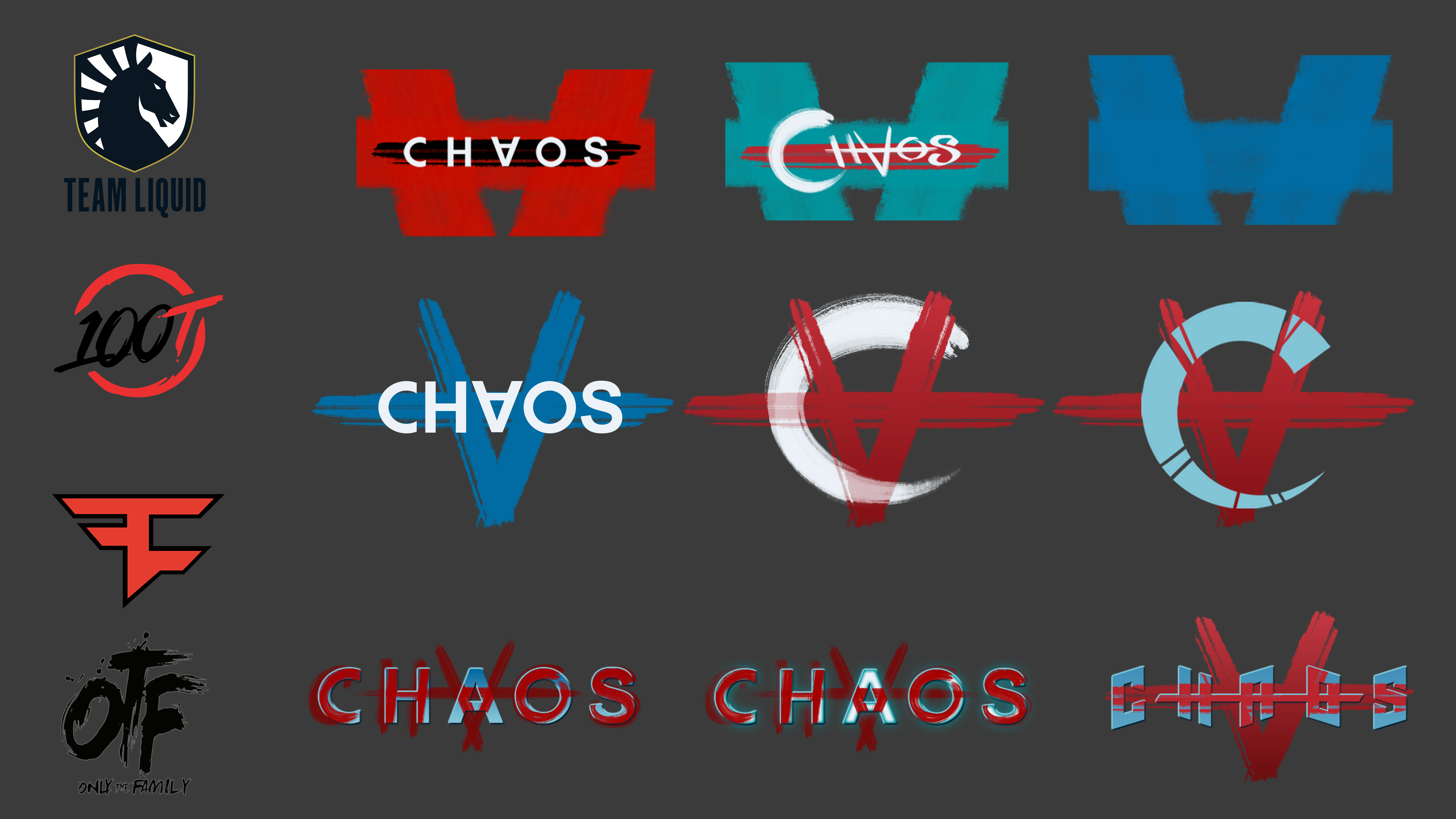
We were given a color palette as well as a few design cues, namely a crosshair and upside down letter A. From here, we explored the idea of chaos in mathematics. These initial designs were inspired by a Lorenz Attractor, a visual representation of Chaos Theory that manifests as a pair of conjoined spirals, vaguely reminiscent of butterfly wings (hence, the butterfly effect). While they liked some of our ideas, it seemed that we had missed the mark.
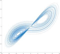
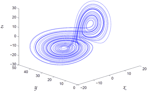
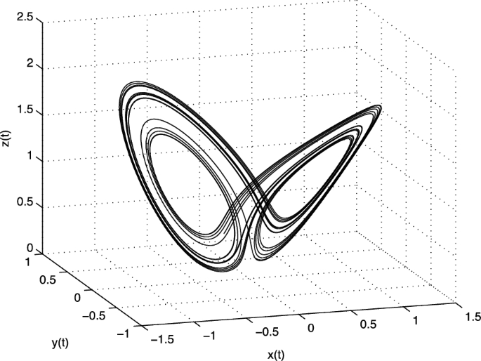
Various Lorenz Attractor models, manifest as dual spirals in 3D space, where we drew inspiration for the initial design campaign
After taking a beat, we regrouped, seeking more thorough direction. During the review of initial concepts, it was revealed that they wanted was something with a darker, more sinister feel, as opposed to merely communicating chaos as a concept. Spirals and butterflies were not quite getting the message across...
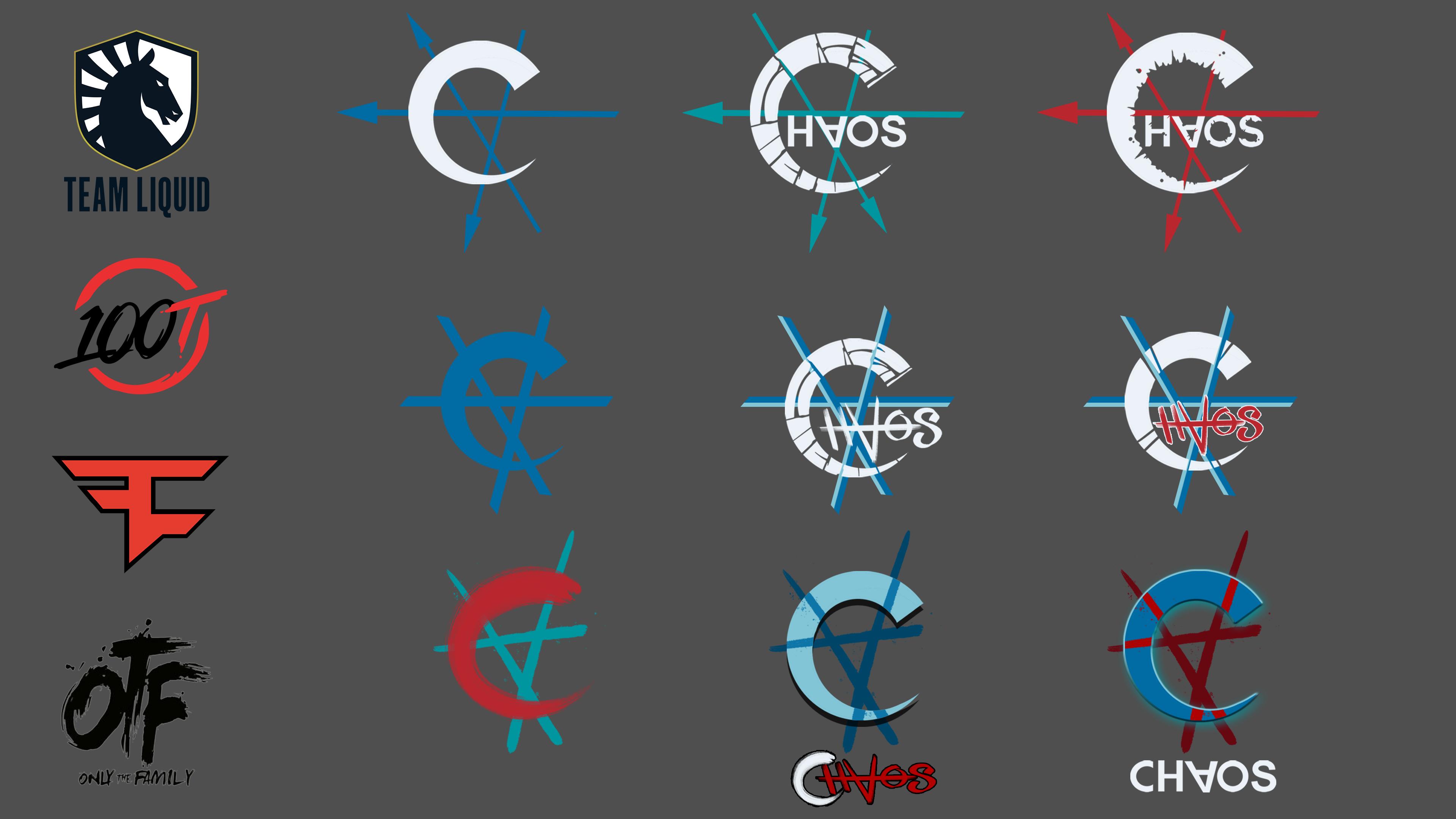
Updated designs and breakdown of elements.
Included are logos for known E-Sports brands for inspiration
Included are logos for known E-Sports brands for inspiration
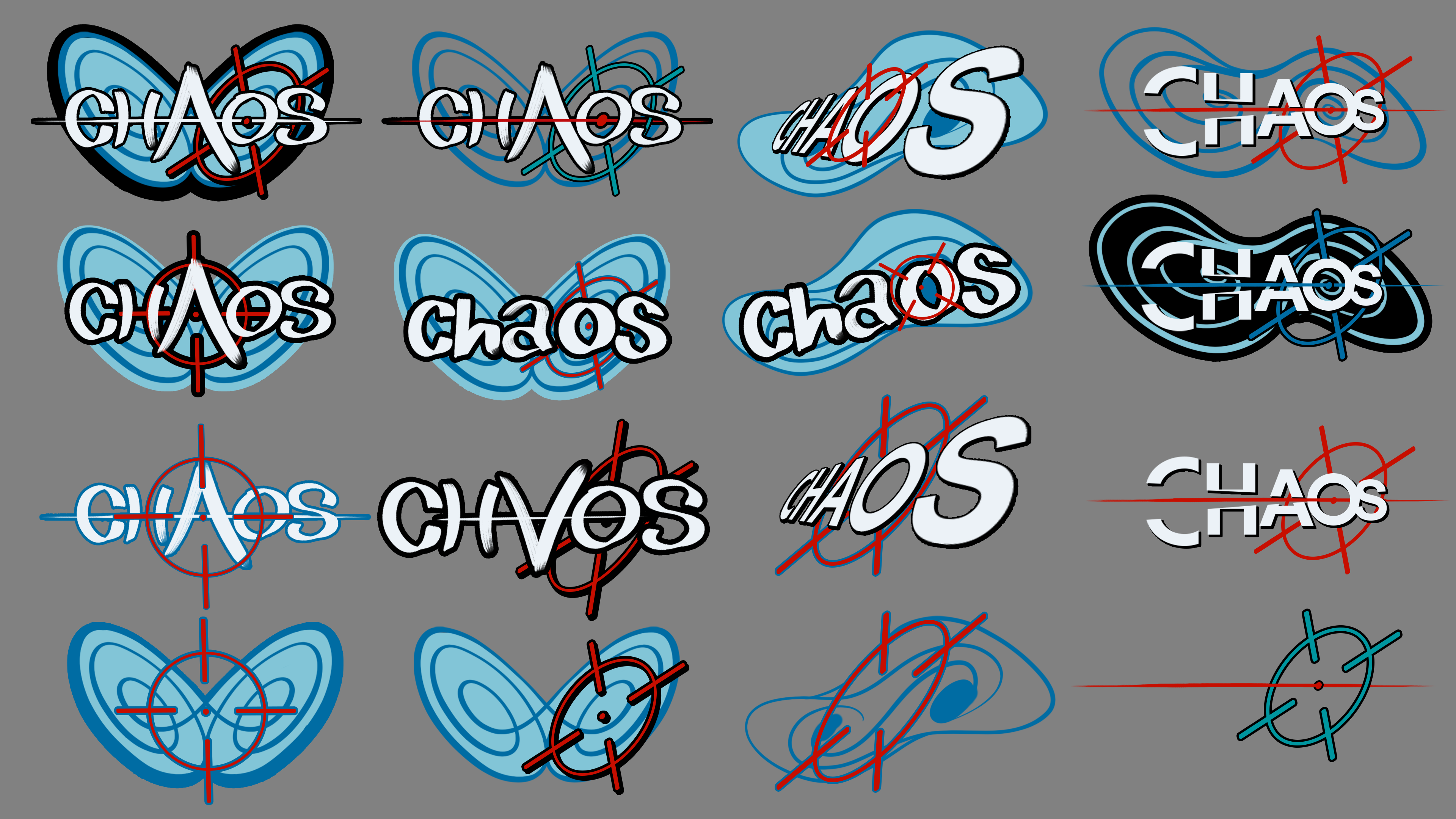
For round 2, we ditched the spiral concept, opting instead to explore a more abstract, industrial aesthetic. We leaned more heavily on the upside down A, playing more with text and texture. Some of these invoke a graffiti affectation. For instance, the upside down A, resembling the Anarchy symbol, sprayed over clean blocky text, suggests feelings of unrest or revolution. We see the A manifest in paint strokes as well as spears or blades, overlaid with a damaged crescent, in a way that comes off as a symbol of a war-like faction or tribe.


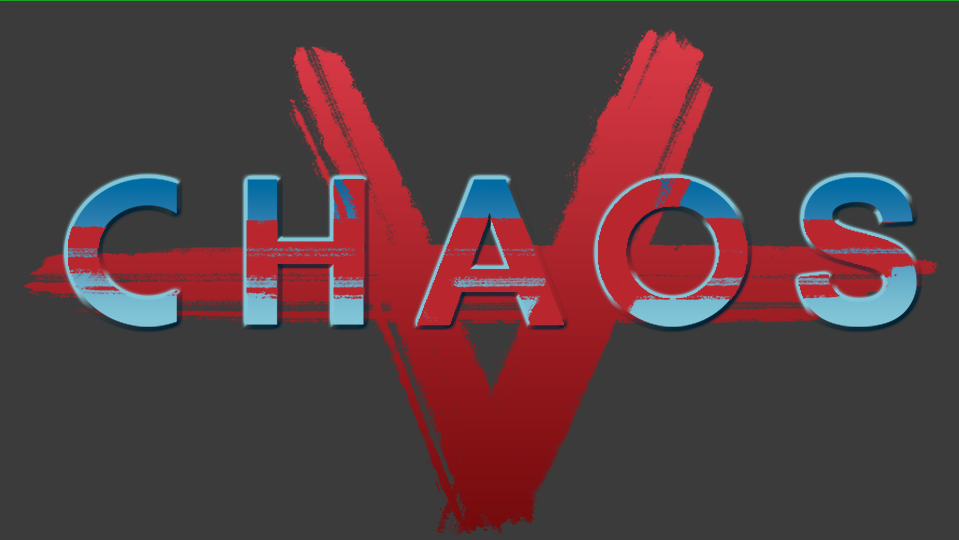
The contrast between clean, graphic shapes and rough, painterly strokes was sought as a means to illustrate the sensation of impending chaos.
While this was a huge step closer to the client's vision, it was not quite there yet. They liked where our heads were at in terms of the title, but what was missing was a striking icon to pair it with. The A paired the the C (or crescent) was not enough. The idea of a brewing revolution was not enough. CHAOS is past that. The end is not nigh, it’s already here!
Up until this point. I had been largely immersed in a clean, cartoonish aesthetic (which, ironically is a marked departure from the sort of stuff I liked to draw most as a kid), so this campaign turned out to be somewhat challenging for me as an artist.
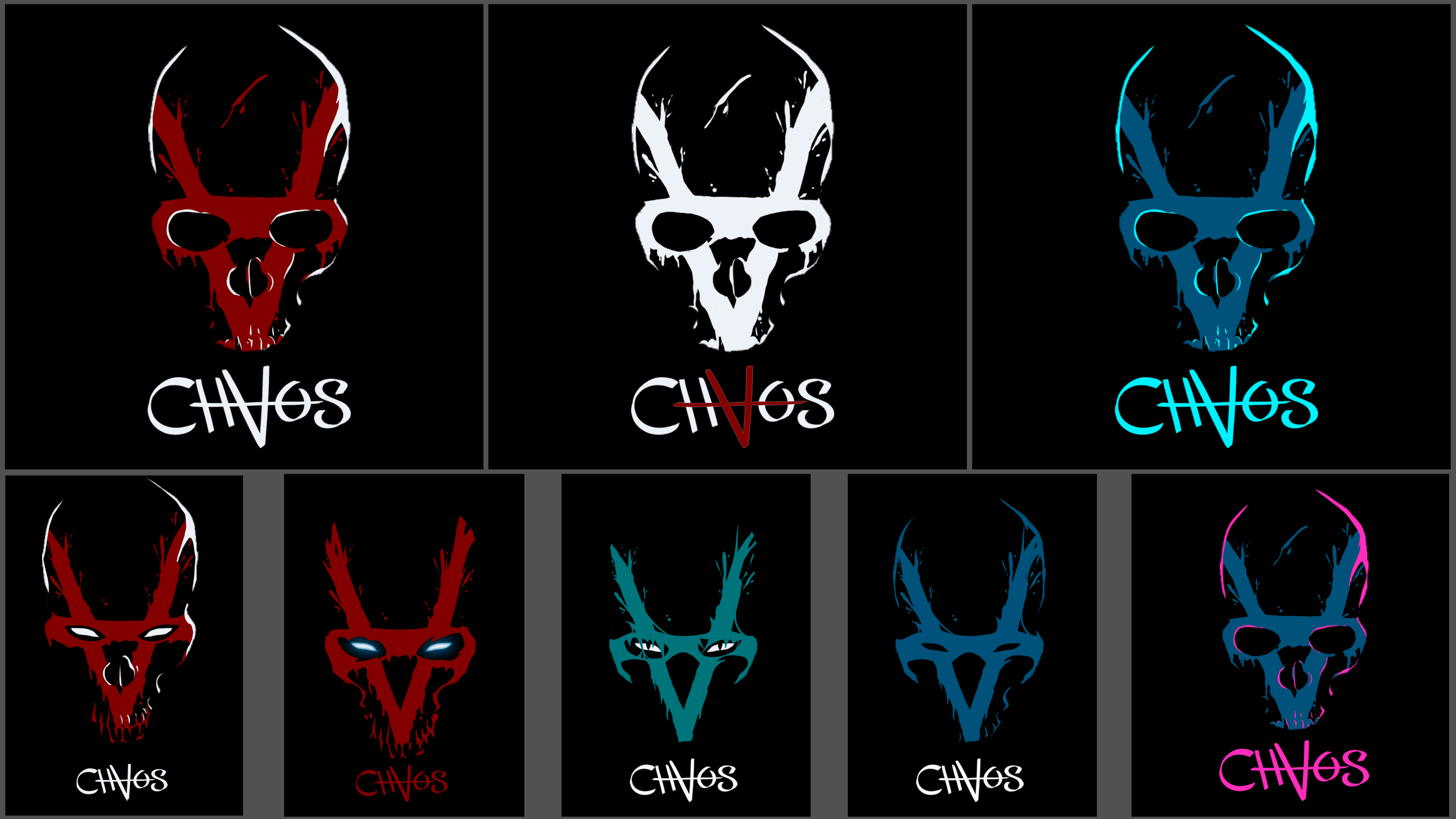
So, CHAOS wanted a hard left turn into darkness, here’s what they get:
An impressionistic splash of paint forming an anarchic symbol, giving shape to an otherwise invisible human skull-like face peering out from the black void; an effigy of violence and mayhem that would surely intimidate their opponents and rock the E-Sports scene!
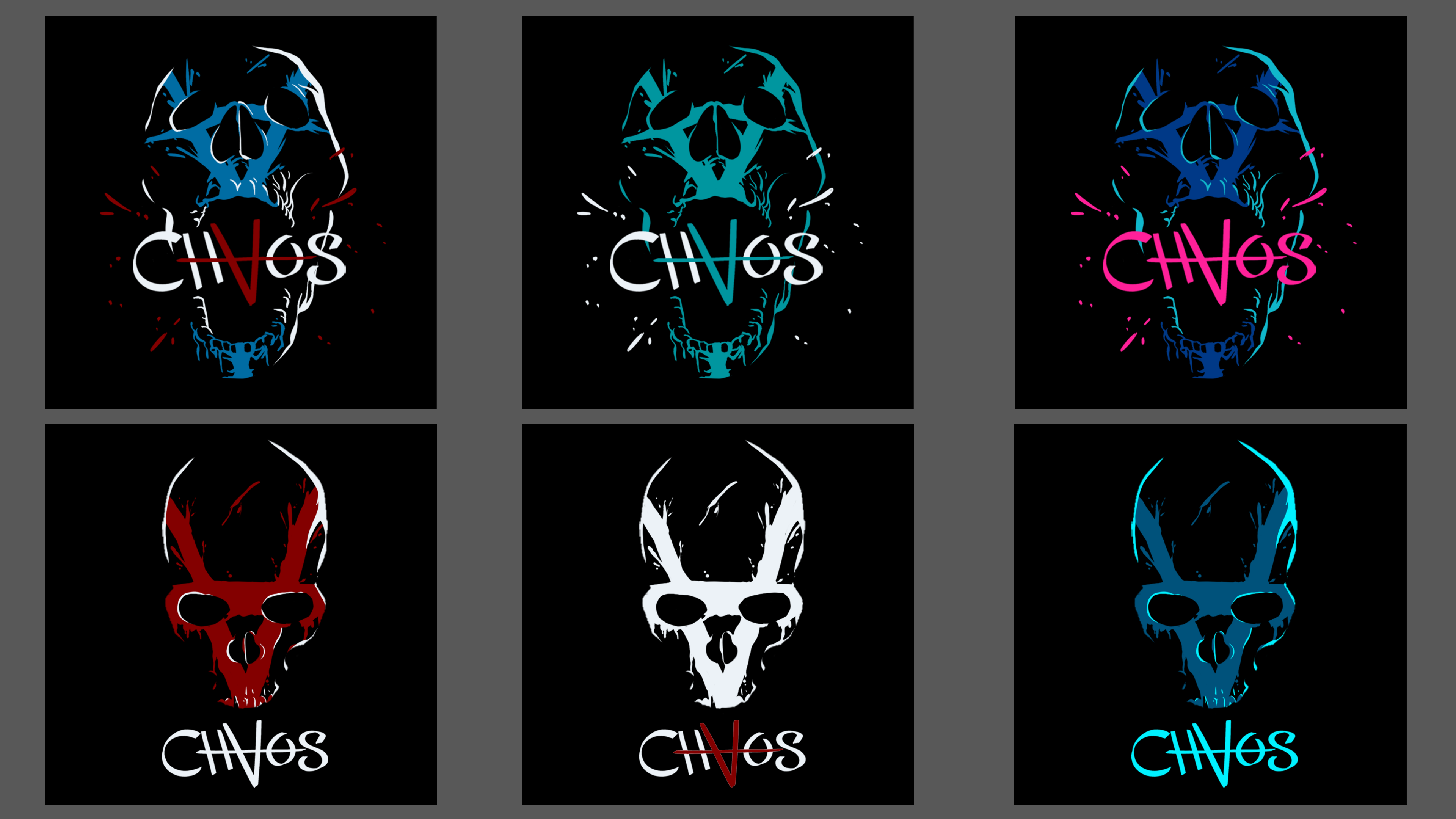
And here we had a concept that our client was totally on board for; one that fully got the message across as they envisioned it. We played around with some iterations - different color schemes, glowing eye effects, a tattered fabric affectation as opposed to paint - but we had found a winner!
CHAOS turned out to be a good way to flex my creative muscle by stepping out of my comfort zone, as well as an important lesson in communication and direction.
This is CHAOS